During the bike and the run I wore a GPS unit that records my speed, pace, location, heart rate (I did not take the time to put on the monitor), and a whole lot more. I love this as a training tool, and also knowing how much I am pushing myself during the race. Most of the images and graphs below are from this unit once I connected it to the computer after the race.
(CLICK IMAGES TO ENLARGE)
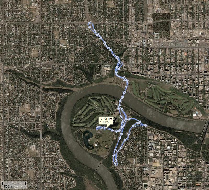 This is the GPS route of my 4 loops around the bike course. Some times my Garmin Forerunner 301 did not get the checkpoint and so there are errors on the map. No, I did not bike through the houses or go off course. haha The unit is good, but not perfect. =)
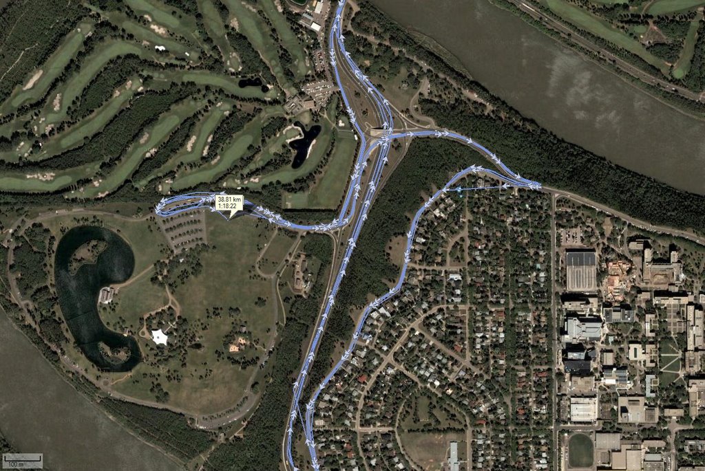 This is a close up image so you can see the starting point at the park and see what the lake looks like a little closer.
(The satellite images were not taken on raceday so you are not seeing the bikes and the set up that was there. Just in case you were wondering.)
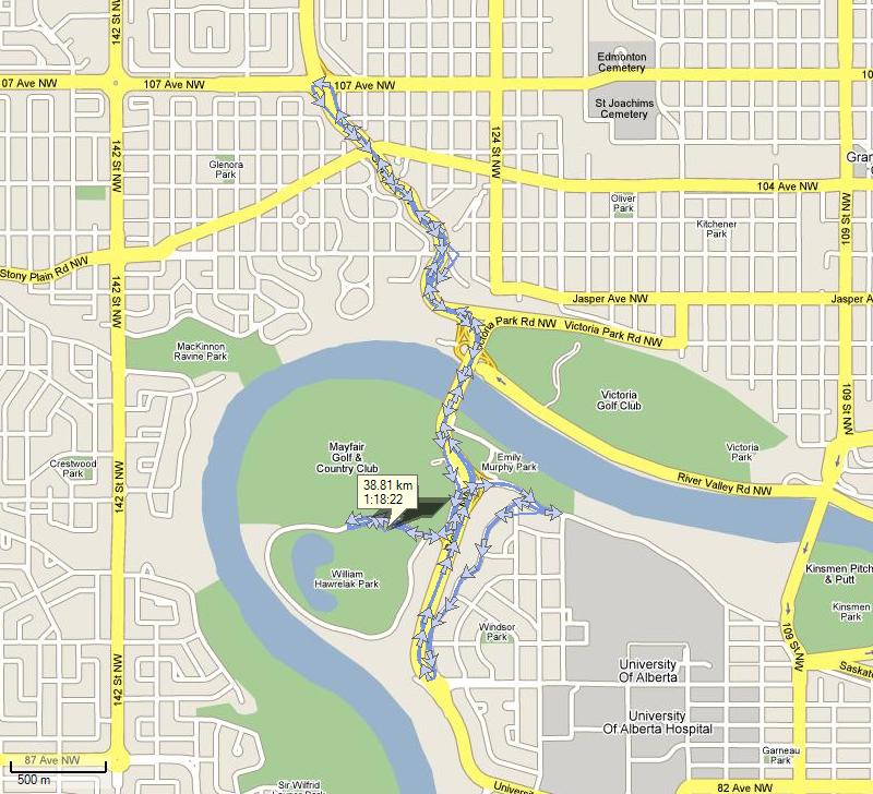 This is a google map of the race course. Here you can see more of the road routes we blazed over as the police had them closed from the traffic.
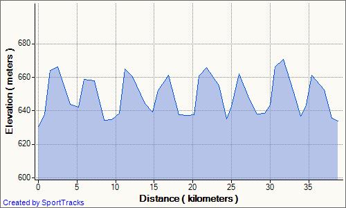 This graph shows the elevation change on the bike ride for the distance travelled. As you can see, there was not much flat sections. We were either going up or down.
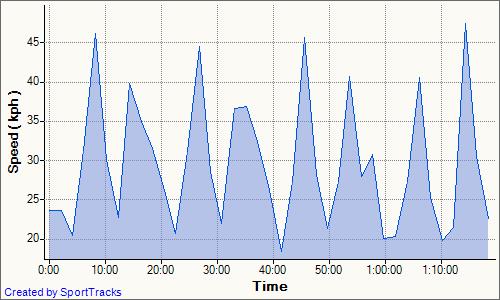 This graph shows my speed and time on the bike. It has a close relation to the graph above. Up Hill = Slow Speed. Down Hill = Fast Speed. =)
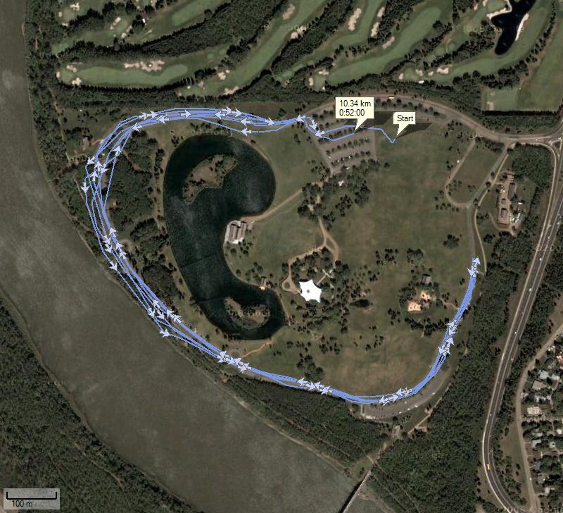 This is the GPS information for my 10k run. You are able to see how far around the park I went. It was a 3 lap out and back. Again, the GPS lost tracking points and messed up a little bit. Oh well.
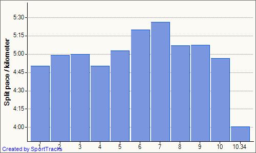 This is a chart of my 10k run divided into 1k split times. I slowed down around the 6-7km mark but then sped up again. My average pace ended up being 5:05.
 This is just another graph similar to the previous one. It is the time and pace graph. It is a little more fluid than the splits.
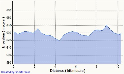 Here is the elevation graph. I think the GPS must have been a little off as I don't see 3 distinct loops. The course was very flat though and so there would only be a difference of 10m or so.
Stay Tuned For The Actual Review!
No comments:
Post a Comment